


Why is the message ‘Thank you for your order’ almost always green, and the error message ‘Email address not valid’ usually red? There are associations between colours and their uses on the web, and everywhere else in the world too.
Colours are interpreted very differently depending on personal associations and cultural aspects. So a colour can look very different depending on who you ask. And yet, many digital services and websites use green as ‘something good’ and red as ‘something dangerous’ by default, giving us instinctive ‘vibes’ about what feelings or actions we need to take.
This is not a post where I want to designate any colour as ‘the best colour’ for a particular purpose, but rather to provide insight into understanding how colour choices affect digital experiences, and why certain colours are chosen for a particular message, or at least recur time and time again regardless of industry or target audience.
Colours have a subconscious influence on our behaviour, actions, feelings and senses.
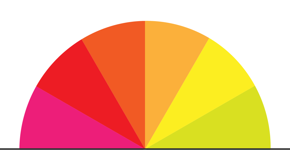
Warm colours
Warm colours are often associated with strength, passion, power, and love. Like fire, the sun, roses, and hearts. These colours capture our attention and are therefore effective if you want to prompt a user to do something.
Warm colours
Red
A strong colour that quickly catches the eye. An effective colour for warning of something urgent, that something is wrong or requires action. The colour is also often used to symbolise energy, power and passion.
Since red has these characteristics and naturally attracts attention, it is almost always used in this way in digital media around the world to signal ‘stop’ or ‘warning’. But it also has a few more associations depending on which world culture you ask:
- Europe: Love, passion, danger, warning signal, strength
- Asia: Happiness, celebration, wedding, purity, success
- Africa: Vitality, courage, blood, struggle
- South America: Love, warmth, passion, heat, revolution, celebration
- North America: Love, desire, danger, energy, warning, anger
Yellow
An optimistic colour that is often perceived as energetic. An effective colour for occasions when you want to attract attention without being too aggressive. Associated with joy, playfulness and summer feelings, but can also convey childishness, danger and warning.
- Europe: Caution, warning, joy, optimism, cowardice, envy
- Asia: Royalty, wealth, power, purity, truth
- Africa: Sun, wealth, wisdom, ceremonial dress, harvest
- South America: Joy, energy, celebration, gold, zest for life
- North America: Happiness, friendship, youth, warning
Orange
An exotic colour that can be used in many different ways, as it combines characteristics of both red and yellow. Often associated with warmth and playfulness, but at the same time attracts a lot of attention and can therefore be used to convey warnings or CTAs.
Globally, orange is a colour used to attract attention and is used for youthful, creative and informal designs.
- Europe: Energy, warmth, creativity, individualism, humour
- Asia: Holiness, spirituality, warmth, enlightenment, happiness
- Africa: Autumn, transformation, sun, earth, community
- South America: Passion, tropical energy, joy, celebration
- North America: Energy, enthusiasm, youth, warning (traffic cones + signs)
Pink
A cheerful colour that often conveys passion and positivity. Often works effectively in combination with other elements as an accent colour in lighter layouts. Historically, pink has been associated with femininity and thoughtfulness, but can also be perceived as childish and impulsive.
In Europe, America and Asia, pink is stereotypically associated with femininity, which has influenced several generations’ perception of colour (the Barbie effect). Digital media often use this to target products specifically at women, by making pink the primary colour in beauty brands, dating apps and wedding websites.
The colour is also becoming increasingly common in other contexts in modern design, in the form of a trend that breaks with the perceived norm. In summary, pink is used to signal a soft, reassuring tone in UI/UX.
- Europe: Love, feminism, youth, elegance, childishness
- Asia: Cherry blossom, transition, beauty, youth, happiness
- Africa: Love between family members, fashion, art
- South America: Love, sensuality, youthfulness
- North America: Feminism, sensitivity, romance, beauty
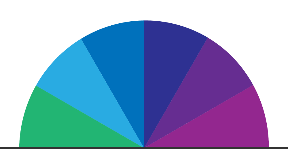
Cool colours
Cool colours are often associated with calmness, security, balance, intelligence and harmony. Seeing cool surfaces usually creates a sense of calm within us, which is why these types of colours are suitable if you want the user to stay on a page for a long time.
Cool colours
Green
A natural colour that is pleasing to tired eyes. An effective colour to symbolise positivity, that something is correct or approved.
The colour has many defined perceptions that many cultures agree on: it is most often associated with nature, health, balance, growth and approval, but can also be associated with nausea, envy and greed. However, North America is alone in often associating green with money.
Globally, the colour is used in web design to convey positive messages, confirmation and success in processes. In traffic, green is used to communicate ‘go’, and this is also globally accepted.
- Europe: Positivity, environmental movement, hope, sustainability
- Asia: Nature, health, growth, vitality, balance, agriculture, security, renewal
- Africa: Life, nature, wealth, hope, future
- South America: Vitality, rainforest, vegetation, nature, soil
- North America: Ecology, security, money, growth, envy
Blue
A calm colour, which may be one of the most common colours on the internet. Like green, blue is also a pleasant colour for the eyes, and is therefore an effective colour for surfaces that need time to be experienced.
Many cultures agree that blue can signal security, logic, technology, reliability, the sky, the sea, coolness and calm.
- Europe: Calmness, reliability, water, loyalty, intelligence
- Asia: Purity, coolness, honesty, stability, craftsmanship, sorrow, peace
- Africa: Peace, stability, water, spirituality, modern technology
- South America: Sky, sea, freedom, spirituality, sport, tourism
- North America: Trust, security, coolness, professionalism
Purple
A colour with mixed characteristics, as it incorporates elements of both blue and red. Generally associated with knowledge, creativity, royalty, technology, drama, luxury, mysticism and spirituality, but can also convey sadness and sorrow.
In web design, purple is often used to stand out and create identity among more common cool colours such as blue and green, and most often to convey its globally associative sense of exclusivity, luxury and mystique.
- Europe: Knowledge, luxury, creativity, royalty, drama, pride
- Asia: Mysticism, nobility, wisdom, nobility, community, creativity
- Africa: Royalty, magic, wisdom, luxury, status
- South America: Spirituality, mysticism, femininity, the power of nature, grief
- North America: Creativity, individualism, pride, feminism (sometimes), luxury
Neutral colours
Brown
A heavy colour that has much in common with green. It is a warmer alternative to black and grey, and works effectively for brands that want to be associated with nature, masculinity, warmth and reliability.
Brown as an alternative to black or grey in web design can also give a brand a more exclusive, timeless feel. Common among brands offering coffee, leather and handicrafts, but also popular among organic, small-scale brands.
In the Western world, brown can be associated with “rustic”, “retro” or “vintage”, interior design aesthetics that emphasise natural or older materials. At the same time, in Asia, brown also has a strong connection to ‘Wabi-sabi’, a Japanese concept and aesthetic that is about seeing beauty in simple and imperfect things.
- Europe: Forest, soil, wood, artistry, warmth, boredom
- Asia: Well-being, stability, realism, reliability, nature, earth, simplicity
- Africa: Agriculture, life, culture, body, identity
- South America: Nature, wood, cocoa, spirituality, coffee culture
- North America: Naturalness, reliability, rustic, warmth
Black
A colour that easily takes on new meanings depending on which colours it is combined with. It works effectively with white to create contrast and is the most common text colour. Black can also play an important role as a background colour for social media or web pages set to ‘dark mode’.
Global associations often include black as timeless, sophisticated, minimalist and elegant, while it can also be associated with darkness, seriousness and sadness. Culturally, black has many similarities, and at the same time many differences. In classical Japanese balance, black, white and wood play a major role in various art forms, and in China, ‘Yin’ represents darkness, femininity and introversion.
The Western world uses black very often and casually, which makes the colour suitable for almost any context. In some Asian cultures, such as India and China, black should instead be used more thoughtfully.
- Europe: Grief, danger, death, authority, luxury, power, evil
- Asia: Emptiness, protection, neutral/powerful colour, not necessarily fara, balans
- Africa: Darkness, independence, spirituality, the origin of life
- South America: Grief, death, mysticism, spirituality
- North America: Grief, professionalism, luxury, rebelliousness
White
A simple, airy and soft colour. Like black, it takes on new meanings depending on how it is combined. It is effective as a background colour, as most other colours are more intense in comparison.
Most often associated with purity, peace, clarity, minimalism, emptiness and isolation in the Western world. Globally, white has the same technical uses, but in Asia its cultural significance is almost the opposite of that in the West. Black is sometimes worn at funerals, but white is even more common as a colour of mourning in China.
- Europe: Purity, peace, innocence, positivity, openness, calmness, future
- Asia: Grief, death, funeral, negativity, emptiness, enlightenment
- Africa: Spirituality, holiness, medicine, peace
- South America: Purity, peace, spirituality, healthcare, education
- North America: Purity, professionalism, freedom, health
Grey
A colour that has much in common with white and black, and everything in between. It is used effectively as a background colour, and many different shades of grey offer visual differences instead of strong colours. Grey also works well as a background colour for secondary text, buttons or forms, and greyed-out fields can also communicate that interaction is not possible until another action is performed on the page first.
Otherwise, it is often perceived as boring and impersonal, but it is also well suited to symbolising stability, technology, balance and minimalism.
- Europe: Neutrality, uncertainty, seriousness, experience, boredom
- Asia: Maturity, tranquillity, wisdom, balance, respect, low energy
- Africa: Metal, industry, weather, balance
- South America: Anonymity, cities, modernity, industry, technology
- North America: Professionalism, technique, balance, neutrality
Personal associations
Personal associations also play a major role in how we perceive colour. A red cup does not necessarily have to be associated with a warning signal; it could simply be someone’s favourite colour for a cup, and therefore associated with joy for that person.
Now we’re giving you a little sneak peek into a project we’ve been working on for a few years, but haven’t really talked about yet. Digitalakademin’s graphic profile uses a bunch of muted colours, inspired by Hilma af Klint’s paintings. Here, cultural associations on a smaller scale become a little bonus – if you are from the Dalarna region and recognise the harmonious feelings that Hilma af Klint’s artwork evokes. Otherwise, the associations of the colours are up to the viewer.

Final remarks
Cultures around the world agree that colours are linked to specific emotions, which is why green and red are globally accepted as colours for ‘good’ and ‘bad’.
That said, red should not be used solely to scare users, and green should not always signal approval. One shade of yellow can evoke completely different associations or feelings than another. And one shade of blue can be just as powerful as one of the warmer colours.
And then it’s not just the colour that determines the feel. All the visual elements of the design – the colour, fonts, images, etc. – are crucial to how visitors perceive your website and your brand.
So it is a good idea to think twice about the associations of colours from different parts of the world before using them on, for example, an international company’s website, logo or graphic profile.
A colour can also just… feel wonderful. With or without motivation.
Please let me know which colours you like and what feelings they evoke in you.
Later!


